Tixe Signs
2016-2018
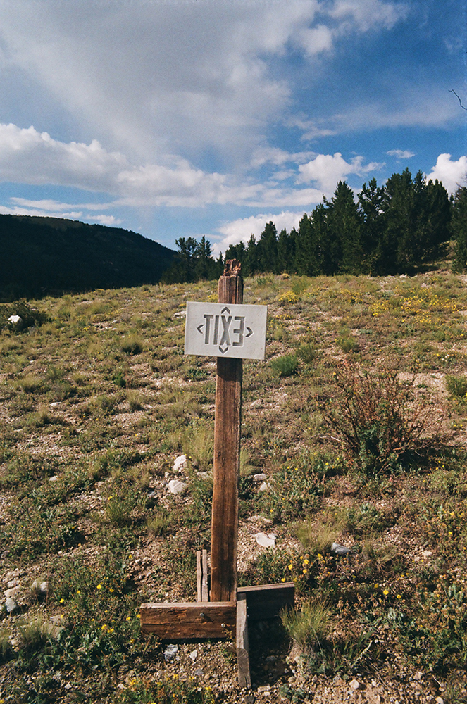
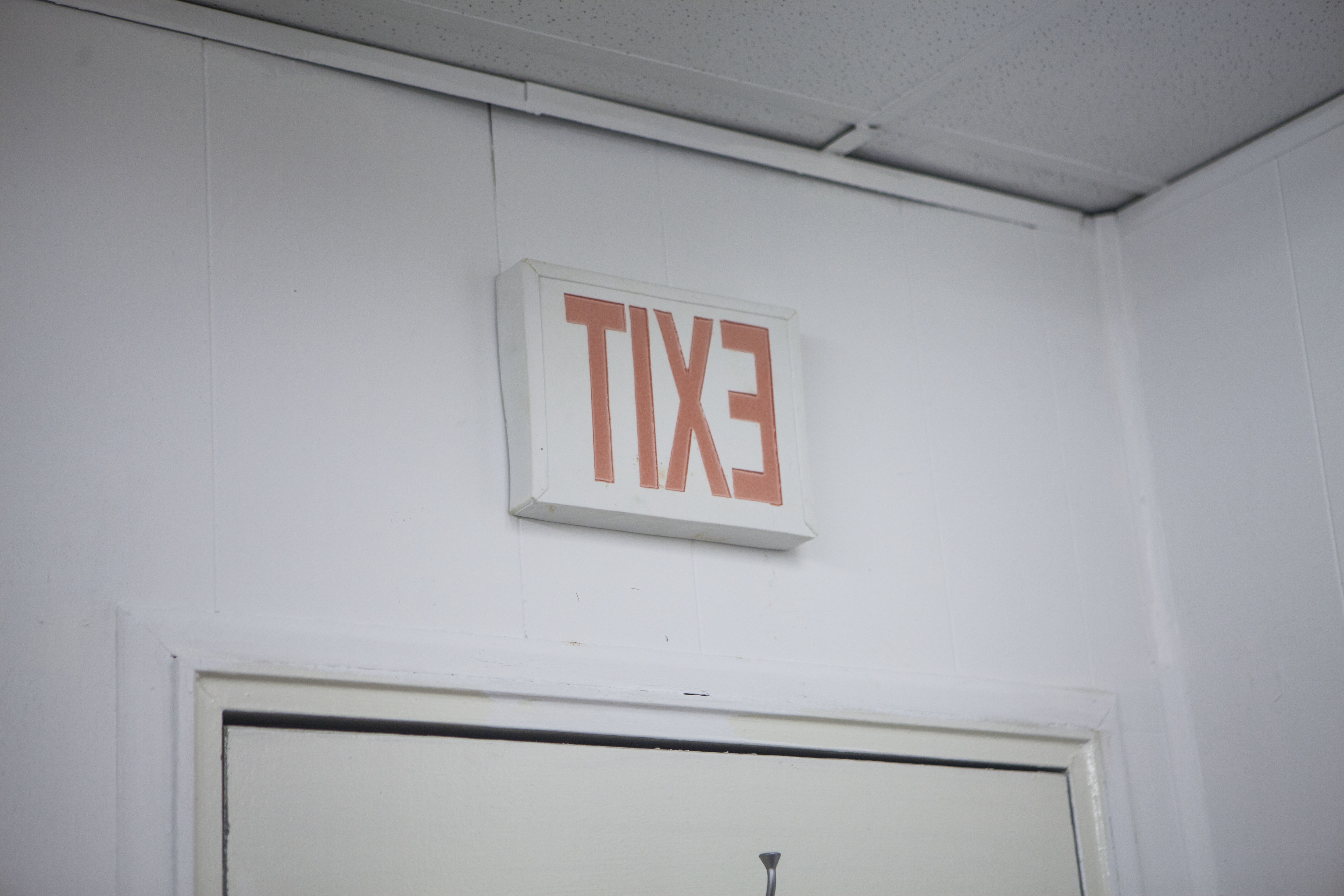
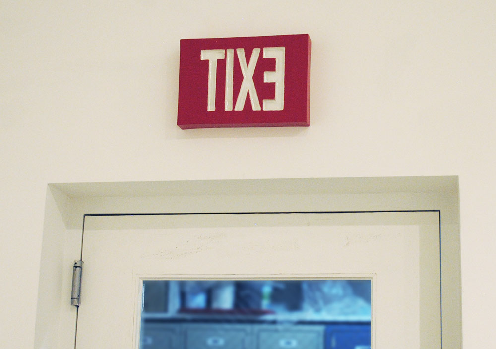
Exit signs are devices that visually indicate the nearest exit and are designed to be absolutely unmistakable and understandable to anyone. They glow in the background of our experience of any kind of public building. They move us through the architecture, to the exit, and in New York are virtually the same red text from building to building. These representations of standard red NYC exit signs have the consistent modification of the reversal of the text to read “TIXE.” Because we are so accustomed to reading exit signs, the modification of the letters becomes hardly noticeable. But, this simple change draws attention to our immediate perception of these objects as reading “Exit” when in fact they say “TIXE.” Each iteration in the series is a simple change in material, from a highly practical plasic or metal to ceramic. There is no reason to have a ceramic sign in this sense: it’s the wrong material for the job. My signage is never meant to confuse or disrupt fire codes, for the distortions to the signs are sufficient for them to be clearly “Art.” However, through this repetition of the “artistic” signs, the viewer will certainly notice the prevalence of the standard exit signs in all facilities, a often unnoticed detail of contemporary life. I began photographing the signs in the mountains in Colorado, for a further absurdity, because essentially there is no exit.
Credit Cards
2016-2018
In some of my dreams, I attempt to use a cell phone or pay for something with a credit card. It never works out well. The numbers and letters all scramble into some cryptic mush that I can’t decipher. It is no coincidence that these are also objects of anxiety about my own finances. They are abstract links to debt. As a way of expressing this feeling, I decided to create gigantic credit cards one may encounter in a dream scenerio. The objects are impractically large, have cryptic code, and are hybrid representations of a credit card and something else like a parking lot, a fence, a cake, or a tie dye t-shirt. Their construction, made of high fire stoneware, and cryptic nature links their appearance to ancient tablets. Over time they can become their own history, potentially humoring archeologists in the year 3000.
My Sneakers
2014-2015
2014-2015

Odd One Out
13.5 x 13.5 x 27 in.
Plaster, Concrete, Paint, Traffic Cone
2011
In 2011 I covered a traffic cone with cement and plaster, then repainted the cone to resemble other traffic cones. I then took it out into Brooklyn and photographed it, out and about, with other traffic cones. I then left it in an overgrown on-ramp sholder of the Brooklyn-Queens Expressway. It was gone the next day.


